@becoming.mahya's reel — transcript & breakdown
Latest update 3 days agoPlays
5.0K
Likes
148
Comments
33
Engagement Rate
3.63%
Create your own version
Use this post as inspiration to create your own
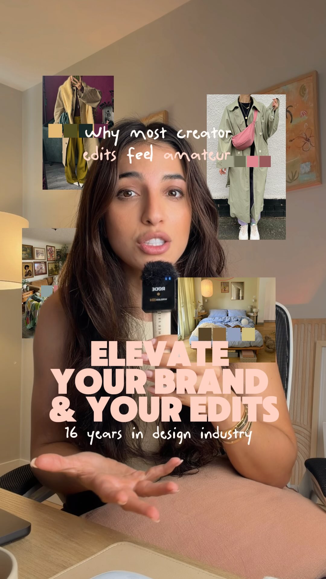
Audio
Calm lo-fi beat playing in the background
Caption
Here are 3 basic design rules you can apply to your feed and edits today to make it look cohesive and intentional: 1. Build an emotional color anchor Stop hunting for random hex codes on Pinterest. Look at your clothes, your living room, and the things you naturally buy every week. Your audience remembers consistent palettes before they remember your handle. Extract tones from images you love or generate functional palettes here: → Adobe Color (color.adobe.com) @adobecreativecloud → Coolors (coolors.co) 2. Stick to the 2-font system Pick 1 display font with strong personality for your hooks and on-screen titles, then pair it with 1 clean sans-serif for body captions and subtitles. Typographic friction happens when two decorative fonts fight for attention on screen. Find pairings and inspiration here: → Google Fonts (fonts.google.com) @googlefonts → Cosmos (cosmos.so) @cosmos → Pinterest (pinterest.com) @pinterest 3. Lock your visual hierarchy Keep your eyeline in the top third of the frame. Leave deliberate negative space around stickers and pop-up text so the eye has somewhere to rest. Give your headline twice the visual weight of your secondary copy so viewers know what to read first. Today is Day 16/90 of pausing corporate to build sth of my own and I am working on my very own editing course YAP Cut: Edit Like a Designer to teach creator taste over technical tutorials, breaking down the exact visual decisions behind every cut. Comment YAP CUT and I will DM you the waitlist link.
Details
Create your own version
Use this video as inspiration to create a new script
Hook
Why most creator edits feel amateur
The speaker introduces a problem that many creators face, immediately grabbing attention with a strong hook.
“These are the three design rules that will immediately elevate your brand and your edits that you can apply today.”
The first rule, on color, is explained with visual examples of how to derive color palettes from real life, making it practical and relatable.
“Stop haunting for random colors on Pinterest. Look at your clothes, look at your environment. See what colors you naturally gravitate towards everyday.”
The second rule, typography, is introduced with clear guidance on choosing and pairing fonts, accompanied by visual aids of various font styles.
“There are thousands of font pairings out there, but I want you to pick one display font for your hooks that genuinely reflects your values and your brand personality.”
The third rule, visual hierarchy, is demonstrated with examples of how to effectively use text and sticker placement to guide the viewer's eye.
“Keep your eyeline in the top third of the video, give your stickers breathing room, and make your headline text noticeably larger than your secondary copy.”
The speaker concludes by promoting her editing course and provides a clear call to action for viewers to learn more.
“I'm teaching this entire philosophy in my editing course, YapCut, Edit Like a Designer is all about taste over tutorial and learning the actual why behind every cut of visual decision. Comment YapCut below and I'll send you a link to the waitlist.”
Details
More viral reels, analyzed
- @lizosooma25.0KЕсли бы я была картофельным блогером, и мне нужно было продать через Reels 10 тонн картошки, то я бы использовала эти форматы.View
- @dr_perekotin94.2KПочему западный интернет взорвался от комбинации третиноина и азелаиновой кислоты?View
 @bylaurendudley12.5Khow I stopped quitting everything I startedView
 @luya.manifest42.4KYou in 6 monthView
- @yurasergienko1116.6KВ кино есть 10 принципов, как рассказывать историю, чтобы её было очень интересно слушать.View
- @im_roy_lee336.8Kthe fastest way to improve at anythingView